POLICYGENIUS.COM
BUSINESS CHALLENGE
Helping users feel confident and in control during complex insurance flows
Policygenius is a leading digital insurance marketplace that helps people compare and purchase policies with ease. But behind every quote is a multi-step process—from application to approval—that can feel long, opaque, and high-stakes to the average user. To address this, I led the design of a visual progress tracker—a persistent UI element to guide users through their insurance journey with transparency and reassurance. The goal was to reduce drop-off, improve comprehension, and build trust by making each stage feel visible, approachable, and navigable as customers were updated via email, text, and signing into their account.
Buying life insurance isn’t a one-click experience. It involves multiple stages: getting a quote, completing a medical form, scheduling exams, underwriting, and final approval. Before the tracker (per the CX team), users would often wonder:
Where am I in this process?
What happens next?
How long will this take?
Customer support flagged this confusion as a leading cause of frustration and abandonment. We needed a solution that could simplify the complexity, set clear expectations, and encourage users to stay engaged throughout the journey.
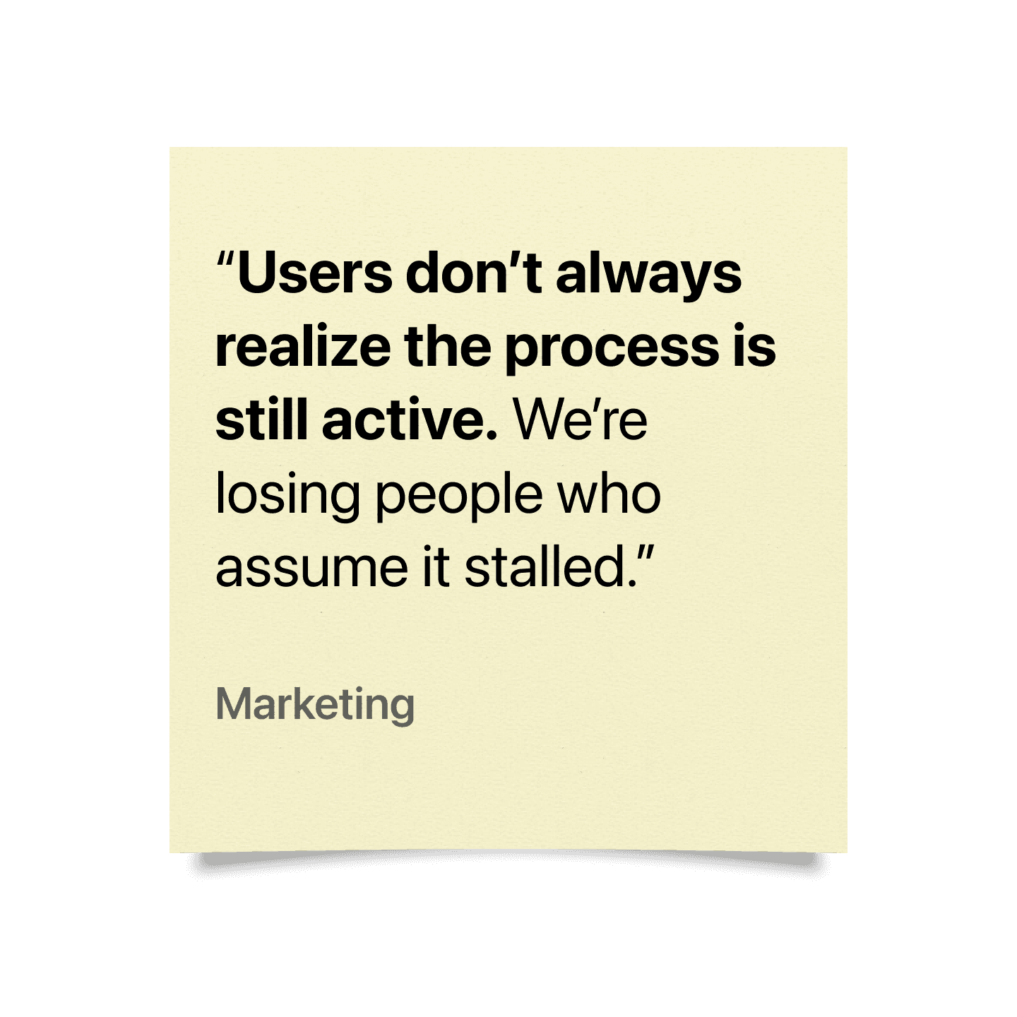
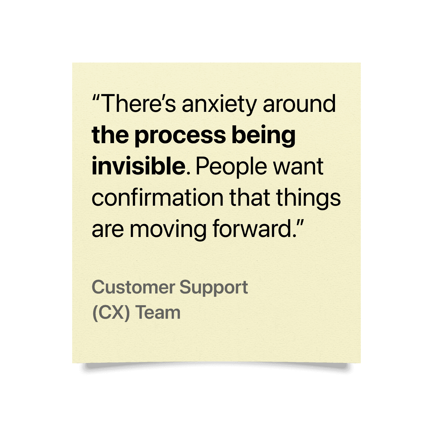
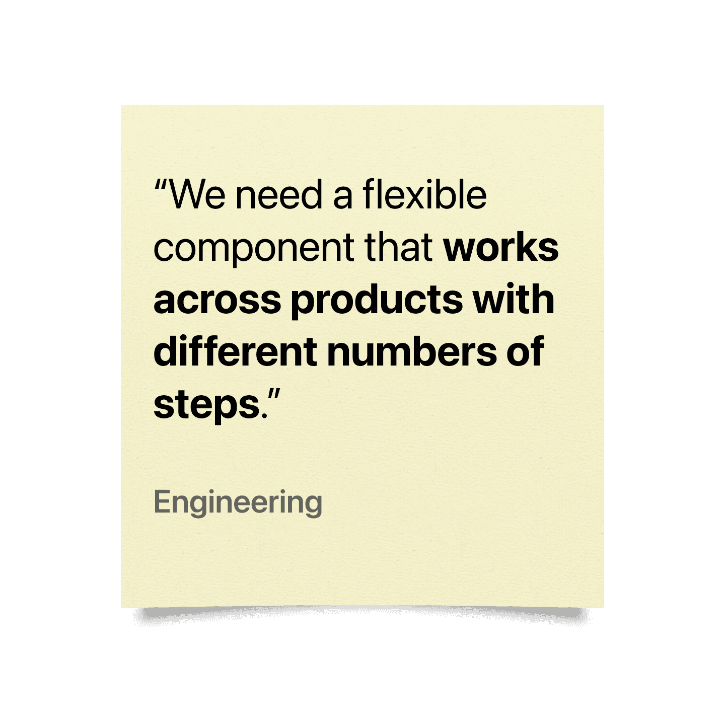
FEEDBACK FROM STAKEHOLDERS
Here are initial examples of stakeholder feedback (from CRM, CX, Marketing, and Engineering) that informed the approach of introducing a visual progress tracker to help reduce drop-off, improve comprehension, and build trust.

APPROACH: PARTNERING WITH THE TEAMS TO UNDERSTAND THE FLOW
As the product marketing designer, I collaborated with CRM, CX, Copywriting, and Product teams to map the business needs and customer feedback into a scalable UX solution. My contributions included:
Identifying key moments of friction and setting expectations for timelines and/or status.
Competitive and adjacent-industry UI research (TurboTax, Credit Karma, Lemonade).
Sketching (pen/paper)
Visual design and motion explorations to communicate progress transitions.
Creating design documentation and presenting rationale to stakeholders.
Start collaboration with CRM team to implement across future application communications.
DETERMINATION
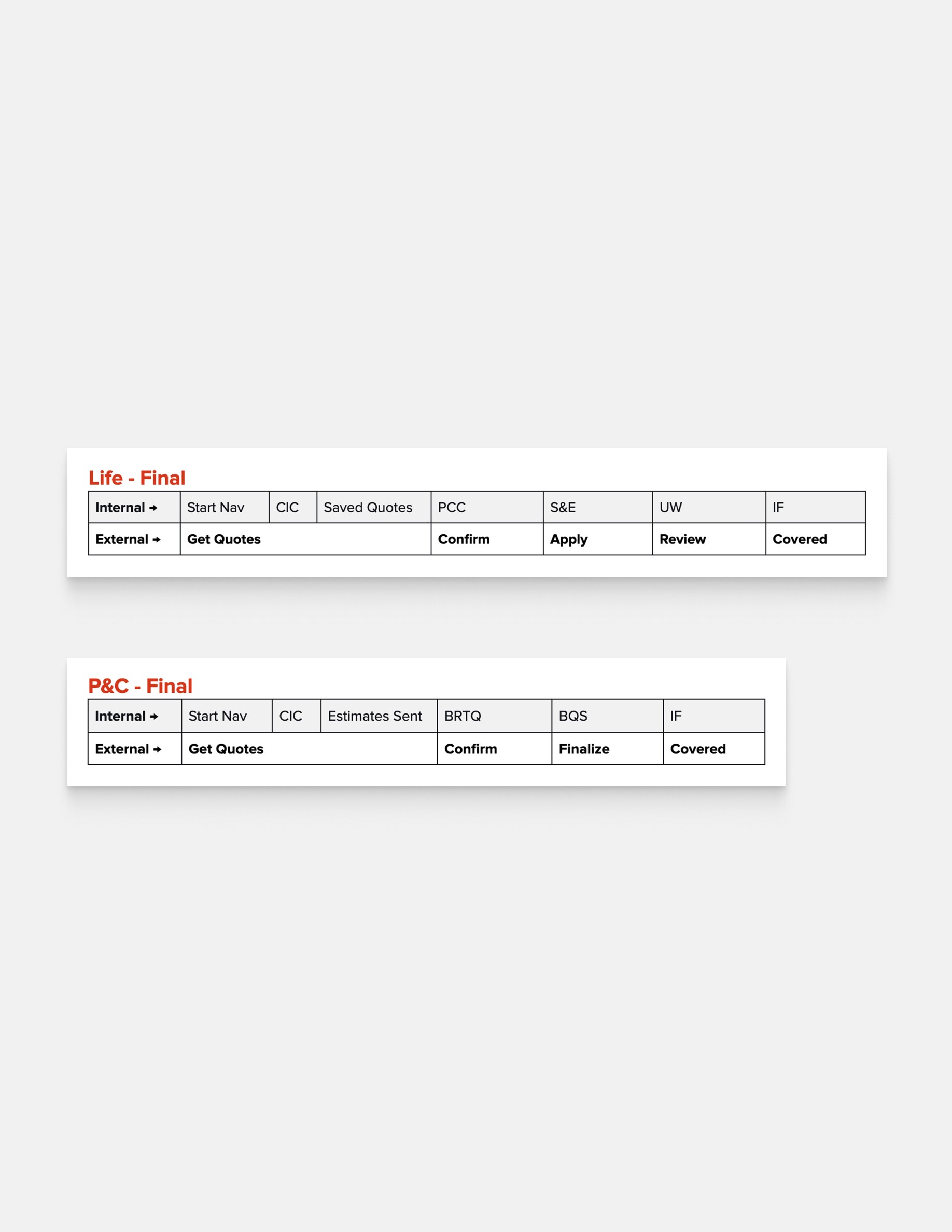
Two Flows, One Goal — Building for Life and P&C
We determined that this component could (and more importantly should) cover more than just the life insurance product. Life insurance has a multi-stage journey with underwriting, medical exams, and approvals that can stretch over weeks. In contrast, P&C products (like renters or home insurance) often offer faster turnarounds, fewer steps, and more price shopping. Instead of trying to force both journeys into the same framework, we designed two tailored tracker systems:
Life Insurance Tracker: Includes up to 5 stages (Quote → Confirm → Apply → Review → Covered).
P&C Tracker: Simpler 3–4 step flow (Quote → Confirm → Finalize → Covered), optimized for speed and clear call-to-actions.
The SolutionS
Designing for reassurance and progess
To visually communicate movement and completion, we used:
Simple step-based progress bars with definitive next steps and timeline.
Subtle animation to reinforce “you’re progressing.”
Supportive, human, and explanatory copy to alleviate anxiety around the approval process.
Designs avoided clinical or overly corporate language and visuals. Instead, we emphasized approachability—a signature of the Policygenius brand—by using clean UI and vibrant colors to visually emphasize important high-level information, and moments of positive reinforcement (“You’re almost there!”). One of the key challenges was that large portions of the insurance process happen behind the scenes. Users didn’t always know what underwriting meant or why it was taking days.So we leaned heavily on supportive, human, and explanatory copy to fill those gaps:
Instead of just saying “Underwriting”, we wrote:
“We’re reviewing your application to ensure you’re matched with the right coverage.”For delays, we included transparency cues like:
“Still waiting on one last step—don’t worry, we’ll let you know as soon as we hear from the carrier.”
This blend of informative and empathetic writing helped reduce confusion, deflect support tickets, and build trust in the process—even when the UI wasn’t actively changing.
Synthesizing the above goals, the results were a final progress tracker featured a horizontal step-based timeline (vertical on mobile scenarios) with clear labels, iconography, and dynamic state changes. Users could see what step they were on, what was coming next, and what had already been completed—without ever needing to guess. Each stage included contextual supporting copy and gentle animation to reinforce progress and help address and reduce anxiety.
Add a lightweight tracker variant: a minimalist version for other applications
We also recognized a gap: not every user-facing communication is tied to a major milestone. Sometimes, users receive emails just reminding them to complete a form or simply providing helpful content. To maintain continuity and presence, we created a stripped-down, icon-only version of the tracker that could be dropped into:
Email headers
Dashboard inbox reminders
Transactional communications (SMS updates)
This version doesn't include supporting details and copy, but visually reminds a customer where they are and a “Sign in to see your full progress” CTA. It kept the journey top-of-mind, even if the email wasn’t a formal status update.By subtly reinforcing movement and transparency, this component acted like a breadcrumb of momentum, keeping users engaged and connected to their insurance flow without overwhelming them.


PROGRESS TRACKER
LEARNINGS